Category: Awful Analysis
How Analysis Goes Wrong: The Week in Awful Analysis – Week #5
How Analysis goes wrong is a new weekly series focused on evaluating common forms of business analysis. All evaluation of the analysis is done with one goal in mind: Does the analysis present a solid case why spending resources in the manner recommended will generate additional revenue than any other action the company could take with the same resources. The goal here is not to knock down analytics, it is help highlight those that are unknowingly damaging the credibility of the rational use of data. What you don’t do is often more important then what you do choose to do. All names and figures have been altered where appropriate to mask the “guilt”.
I once again heard the same common mistake in determining where to test earlier today, and it reminded me of the topic for this next Awful Analysis. It is super easy to find data that you believe is “interesting” or “compelling” that in no way actually makes a rational argument that you are attributing to it. An example is as follows:
Analysis: We found that people that interact with internal search spend 1/3 as much as people who don’t. This tells us that there is a massive opportunity to optimize internal search and increase total revenue.
This is probably the most common type of search for “test ideas”, as it sounds like a rational argument and it is using real numbers. The problems come from the fact that the data presented is a non sequitur as far as what to test. These types of arguments are interesting stories and I actually do not always suggest you do not leverage them. My problem is when people start to believe the story and do not realize just how irrelevant the information presented is.
As a reminder, the only way to know what the efficiency or value of a test is requires three pieces of information: Population, Influence, and cost. With that in mind, I want to dive into this type of analysis:
1) You have no way of knowing from the analysis (or any correlative information) if people who spend less do so BECAUSE of the use of internal search, or if people who are going to spend less are the ones who aren’t quite sure what they are looking for and instead choose to buy cheaper things. It could also be that you get a lower RPV because people doing research ARE far more likely to use search to compare items.
2) You have no clue that even if you are right that they are more valuable, if the search results page is the place to influence them, or if it is the entry channel? Or the landing page? Or maybe the product page?
3) You have presented no evidence to your ability to influence that group even if you ignore #1 and #2. Even if you have the perfect group and the perfect place, you still have no insight into what to actually change.
4) There is nothing presented that says that this same group cannot be improved far more dramatically by looking at and interacting with them based on other population dimensions. Last I checked, new users, search users, purchasers, and IE users also use internal search.
5) There is no look at the cost to change this page (and population) versus known results or even just the technical ramifications. Search Results pages are often one of the one or two hardest pages to test simply from a technical resources and page interaction front.
More than anything, the threat of this type of analysis is that it sounds perfectly rational. Who wouldn’t want to “fix” a group that is spending 1/3 as much as another group? Why aren’t all users spending their entire paycheck on my site and my site only? You have to make sure that as the analyst that you are presenting rational fact based data if you expect anyone else to leverage data in a rational manner. You might be right or you might be wrong, but if you do not stop yourself from falling for these stories and do not hold yourself to a higher standard, then how can you expect anyone else to. If you are going to find data to tell a story, then what is the point of the data other than to present your opinions versus someone else’s?
How Analysis Goes Wrong: The Week in Awful Analysis – Week #4
How Analysis goes wrong is a new weekly series focused on evaluating common forms of business analysis. All evaluation of the analysis is done with one goal in mind: Does the analysis present a solid case why spending resources in the manner recommended will generate additional revenue than any other action the company could take with the same resources. The goal here is not to knock down analytics, it is help highlight those that are unknowingly damaging the credibility of the rational use of data. What you don’t do is often more important then what you do choose to do. All names and figures have been altered where appropriate to mask the “guilt”.
For this weeks How Analysis Goes Wrong, I will be tackling directly a suggestion made on one of the more “popular” testing websites in the space. I will not be touching on everything that is wrong with the actual evaluation, as my problems with WhichTestWon are long stated and it is just too easy to poke holes in. Needless to say, we have no idea if the test was called by the correct use of data and not just blindly following confidence, nor do we know about other feasible alternatives, how big the scale of impact relates to other tests for that organization, or even what the population and time frame of the test was. Without any of that information, the entire practice is purely ego fulfillment and provides no functional information viable to a company.
In this case, you can find the example here. The specific comment in question is the 5th one listed by an Igor. I understand the trollish nature of all online comments, but because this seems to be presented as straight faced as possible, I have no choice but to evaluate it as if it was designed to be legitimate meaningful analysis. The comment in question is:
“I also picked green mostly because it created a sense of appetite. Blue was a bit too disconnected, didnt cause any emotional response even though I also use a blue button on my ecommerce site. I guess I’ll have to change it 🙂
Based solely on my experience, I’d say here it wasnt a question of CTA visibility (since they tested orange too) but the green color’s ability to initiate an emotional response of freshness, airiness, freedom. Orange would cause an emotion of warm, a bit heavy sensation and overly stimulating.
Considering that we’re bombarded with heavy colors in supermarkets, we may be looking for a way to feel less forced to make a decision online, and green seems to be the color of choice…especially this particular shade of green.”
Understand that I am in no way diving into my beliefs into color theory. I am honestly agnostic about its validity, as it is important that what wins is not biased by prior beliefs. We are only looking into the value of the “analysis” presented as it pertains to acting on the results from this specific test. Because of the sheer scope of problems here, I am going to only highlight the top ones.
1) He assumes something that works on another site will work on his.
2) He assumes why it changed from a single data point
3) He starts a massive non sequitur time sink about the supermarket colors and the “forced” decision online.
4) He reads in that it was green as a whole and not the specific shade or just the execution of colors. I am trying to ignore the entire, it is only two colors, you can’t tell anything about if this was the best use of resources at all problem, but even ignoring that, it is a single data point.
5) He assumes the change had anything to do with an emotional response and not the millions of other possible explanations
6) The entire test measured conversion rate, not revenue, meaning that all conclusions could be drawn to something that loses revenue for the company. You can never assume more conversions means more revenue, or the linear relation between any two objects.
7) He ignores almost completely interaction between other elements.
With the large amount of storytelling and absolutely nothing presented that adds value to the conversation, the entire purpose of exchanges like this is to make it sound like you are an expert on something without presenting credible evidence to the value of that claim. If you are right, then a test will show your choice is best amongst all feasible alternatives. If you are wrong, then who cares what you think. In all cases, storytelling belongs in kindergarten and not in the business world.
Sadly, that is not the end of it. The follow-up comment shows why so much of the business world are people who exist solely for the propagation of people just like them:
Thanks for the insights Igor, I’m a huge fan of color theory and how it impacts us psychologically. Glad someone brought this up!
We have just seen the propagation of agendas in action. No one added anything to the conversation, no one presented anything resembling rational data, nor did they present anything that could possibly be used to rationally make a better decision in the future, but both feel justified that this is the value they present to a conversation. The only nice part of this is that people like this have made my job, turning organizations around and showing them how to get magnitudes higher outcome based on just betting against people, so easy. Without them, I too wouldn’t have a job. We are all connected on some level…
If there is an analysis that you would like to have reviewed, privately or publicly, you can send an email direct at antfoodz@gmail.com
How Analysis Goes Wrong: The Week in Awful Analysis – Week #3
How Analysis goes wrong is a new weekly series focused on evaluating common forms of business analysis. All evaluation of the analysis is done with one goal in mind: Does the analysis present a solid case why spending resources in the manner recommended will generate additional revenue than any other action the company could take with the same resources. The goal here is not to knock down analytics, it is help highlight those that are unknowingly damaging the credibility of the rational use of data. What you don’t do is often more important then what you do choose to do. All names and figures have been altered where appropriate to mask the “guilt”.
On this version of This Week in Awful Analysis, I wanted to start diving into the many false conclusions that people draw from the results of tests. There are problems from things like confidence, correlation, bias, and all sorts of drivers, but the most fundamental one is a failure to properly frame the result itself.
I want to walk you through a standard test experience. In this case, we are running a simple inclusions/exclusion test, where we see what the impact is of removing a certain item from the page. In this scenario, we ran our test, have gotten 1 week of consistent data (about 16 days total), have enough differentiation and enough data, so we are ready to call our test:

In this scenario we see we have a winner, and so we report this winner to our org, suggest we remove the section, and move on…
Except that is the only part of the story we allowed ourselves to look at, due to a failure to think about and set-up the test in a way to show us what the best option is, not just a better one. In this scenario, let’s look at the exact same data, but in the larger context of the test that was really run:
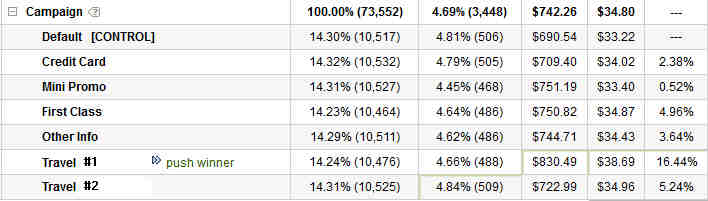
In this case, we still have the same 2.38% lift, but we can see that in a larger context, that is only the 3rd best option out of the 7 different ones we are looking at. Had we failed to set-up the campaign to look for the larger context, the new would have thought we were accomplishing something, while in reality we would have been throwing away 14% lift (16.44% – 2.38%). Would your pat yourself on the back if you were reporting a 14% net loss to the business? Do we reward you for the 2% gain or the 14% loss? This is a real world situation, but this plays out all the time when you fail to look past opinions and you only test what someone is asking for or wants to see win. We fail to get perspective, so we are leaving winners our there left and right, winners that would dramatically impact the entire business. Why then is it ok to validate some basic “hypothesis” without diving into the larger context and looking for the best answer?
Not only are you actually losing money left and right when you do this, but you are also driving your optimization in the future to suboptimal paths. This is how you get into local maximums and how programs can get stale. This is also why test ideas are the least important part of a test program, since they only constrain people’s imagination and their ability to look at feasible alternatives. Testing and optimization should free people up to go far past their comfort zones, as the system only really works when you get great divergent inputs. The more divergent, the better the inputs, the more likely it is that you will get a far better outcome for your business.
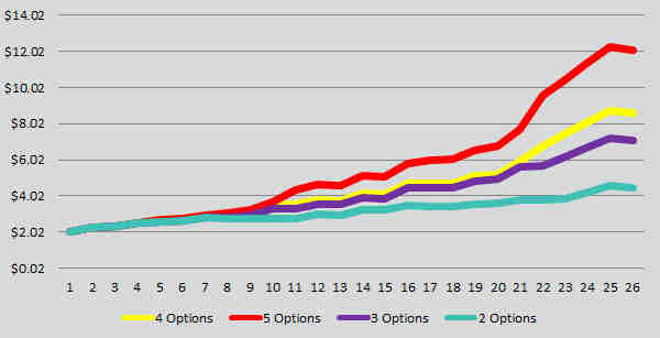
Overtime, this can have massive impact to the bottom line of any business. Here is a breakdown of a random number generator using normal distribution and the power of options (you only choose the best performer) looking at the impact of having 2, 3, 4, and 5 recipes in all your tests:
There is little to gain from running more tests, it is far important to run better tests and to look at alternatives, not to sit in a validation world of making people happy. If you fail to tackle the test with discipline and by challenging people’s opinions, you are dramatically limiting any possible impact you get.
If nothing else, never take just the act of getting a winner as a measure of a successful test. That is a sign that you are not trying to improve the business, just make yourself look good. Instead look at optimization as the ability to measure feasible alternatives, to have an active data acquisition which allows you to measure paths and to go down the best path. Do that, and you will add magnitudes greater value to all the actions you take.
How Analysis Goes Wrong: The Week in Awful Analysis – Week #2
How Analysis goes wrong is a new weekly series focused on evaluating common forms of business analysis. All evaluation of the analysis is done with one goal in mind: Does the analysis present a solid case why spending resources in the manner recommended will generate additional revenue than any other action the company could take with the same resources. The goal here is not to knock down analytics, it is help highlight those that are unknowingly damaging the credibility of the rational use of data. All names and figures have been altered where appropriate to mask the “guilt”.
What you don’t do is often more important then what you do choose to do.
This week for How Analysis Goes Wrong, I wanted to start covering a number of the many errors in rate versus value and how it can be used to pretend to know things that you really don’t. I figured I would start with the most obvious example there is, which would be “how much revenue comes from email”. So many times in the realm of optimization you are faced with having to stop people from applying resources towards actions that could never produce meaningful results. The most obvious of these is email.
Analysis: We want to optimize our email because 60% of our revenue comes from email.
There are a number of problems with this, but let’s tackle the analytics ones first, and then move on to the optimization ones.
1) You have no clue if 60% of you revenue COMES from email, you only can attribute 60% of revenue to email. The difference is this. In attribution, you can’t say what direction something happens, only that a group of people have a common trait (usually channel). You cannot in any say if email drives 60% of your sales, or if in the real world situation, the people who want to spend a lot of money on your site on a regular basis might be inclined to sign up for email.
2) It suffers from the graveyard of knowledge effect of not saying what the difference in performance of people with and without email are, especially since it is only looking at success of revenue and not all users.
3) It assumes that just because 60% of revenue comes from a group that optimizing that group is more valuable than any other group. Unless you know your ability to change their behavior and the cost to do so, you cannot ever make that gross assumption.
4) Statements like these are used for internal competitive evaluations of groups (paid, email, display, etc…). People are going to abuse data, that is a given, but the fact that someone who is responsible for optimization or analytics, the one person in the company who should be most concerned with the correct portrayal of data in a rational sense, is the one most likely to make a statement like this. Keep your data people away from politics!
I can go on, but I want to dive a little deeper into the evils of email testing. It is not that email testing cannot produce results; it is simply that the scale of those results and the cost to do so is so insanely high that there is no point in ever going down that path.
Here is some example math. If you are interested, this assumes a 20% higher action rate and RPV compared to an actual extremely larger retailers actual performance. It assumes a 10% margin on actions. Both of those are actually higher than the customer in question, but I wanted to over promise value to show how obscured optimizing email can be:

Open rates and all other metrics come from this article, but there are many other similar sources out there.
I usually share a story with people when we get to this point, which goes like this. I worked with a very large ticket reseller who had spent 2.5 years optimizing their email, and had been able to achieve a 120% increase through having 2 full time resources spend that time on nothing but optimizing their email. The total value in increased revenue they derived was around 600k, which sounded great.
My first week working with the customer, we went to the least political page, used existing internal resourced, did a simple real estate test, and that test was worth approximately 6 million.
Total time spent on conversation and setting that test up, 1 hour.
Future testing continued to show similar scale of results without even touching their most political pages. In 1 hour, we were able to show that they wasted 2.5 years and all those resources chasing a mythical dragon. The real punch line of this story is the reason they did all that work is because they “knew” that 72% of their revenue came from email.
Do not let this happen to you.
